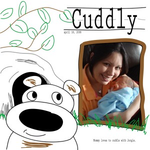
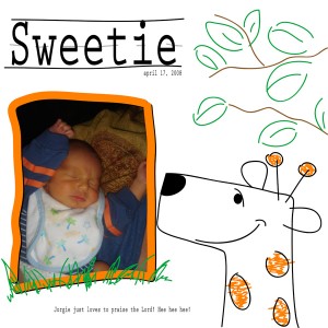
I’m gonna try to select a “Digital Layout of the Week”, every week, and deconstruct the design process for the benefit of any newbies to the digital world and for the veterans, maybe we can learn something new! Please leave your comments and questions and I’ll be happy to answer.
This week we have two single photo digital scrapbook layouts, “Cuddly” and “Sweetie”. Here’s how these were created along with notes on the software used:
1. PhotoShop or Illustrator?
It’s up to you. If you want to edit your photos (ie. add effects) then PhotoShop is better. But, both have similar tools and are compatible with each other. I sometimes create patterns, doodles or a drawing of something (like the giraffe and bear) in Illustrator and later open them in PhotoShop and make the rest of the layout there. For this weeks layouts I used Illustrator only.
2. What theme or color palette? (ie. abstract patterns, events, travel, etc.)
I wanted a “playful kiddie” look so I grabbed the brush tool and started doodling. I came up with the giraffe first and then built around that. The leaves and branches came next, and then, the frame and grass. The color palette menu, by the way, is very similar to the one in PhotoShop. To add to the kiddie drawing look I drew the lines you see behind the titles to mimic those “learn to write” books kids use at school.
A note about Illustrator:
The neat thing about drawing in Illustrator is that whatever is drawn is “vectorized”, meaning, that a line for example will have several vector points, depending on the shape whether straight or curvy, which you can click on and manipulate to either make the line straighter or smooth out curves. Here’s an example of what I mean:
3. Placing the photos.
Placing photos is easy. Click “PLACE” found under the “FILE” menu, and browse through your computer to wherever your photo is located and click “OK”. You can resize the photo using the scale tool. For these layouts I placed the photos and sent them to the back so that the frames are on top. You can instead place the photos in a separate layer, just create the layer before placing them and make sure the layer is selected and place the photos. Then you can change the order of the layers so that the “photo” layer is under the layer where the frames are.
Another note about Illustrator:
Unlike PhotoShop, in Illustrator you have to create layers, if you want more layers. In PhotoShop just by copying and pasting let’s say a photo, once you click paste, it pastes the photo on a new layer. In Illustrator you have to create the layer first then click paste while on the layer you created. Sounds odd? Well see, if you don’t have layers automatically created for you in PhotoShop everything you paste or type stays on one layer and then you can’t click on individual items to edit them. On the other hand, in Illustrator you can create a complete layout on one layer and still be able to click individual items (ie. text, lines, photos, shapes, etc.) and edit them with no problem.
4. Title and Journaling.
To keep with the theme I wanted to use a font that sort of looked like a child’s handwriting and in this case I went with one called Prestige Elite Standard. I used it on the titles and all other journaling.
One more note about Illustrator:
Something I love, love, love about Illustrator is that since you’re working with vectors, resizing objects is a breeze without sacrificing resolution. For example, you can create a 6×6 layout or even a tiny 1×1 layout and later resize it to 12×12 or more and everything stays sharp!! It’s great!
5. That’s It!
I could get a lot more technical, but, it’s not necessary, at least as far as these two layouts are concerned. If you have any questions about using Illustrator or PhotoShop let me know! I check this site constantly!
If you’d like to purchase these two layouts (without the photos and journaling, of course) check out the Shopping Nook. I’ll include the font as well.
Happy Scrapping!


 Illustrator CS3
 PhotoShop CS3
Free tattoo designs says:
I like your blog design. What template did you use ?
bingo uk says:
Interesting article i totally agree with the other comments. Keep us posting
Cristy says:
Christie, I print my pages on an Epson 1900. It’s a wide format printer that allows me to print right on 12×12 paper. However, I have used Shutterfly before to print 12×12, sometimes it’s easier and depending on their coupons, it’s also cheaper than printing them out myself. Since the layouts are digital I can also resize them to 8×8 and 6×6 so in that case I print out the layouts using my other printer which is an Epson Stylus Photo RX580. There I print either on an 8.5×11 paper or on an actual 8×8 or 6×6 paper. Hope that answers your question. Let me know if you have any more questions. 🙂
Christie says:
So where do have your pages printed?